


According to the latest studies majority of internet traffic, today is yielded by mobile devices. People are mostly interested in mobile browsing which is quite handy and can be done at one’s leisure. Hence, it has become essential for developers these days to enhance user experience using a variety of web design approaches. One of these approaches is mobile website optimization, which we are going to discuss today.
What is mobile website optimization?
Mobile Web Optimization is a web design approach that provides the capability to a website to adjust itself according to mobile device parameters. Such an optimization enriches websites on mobile devices with alluring looks, making it easy to navigate by enhancing the overall ease of accessibility as per different screen standards of mobile phones available today.
Why is mobile website optimization necessary?
A straightforward answer to this is to enhance the user experience. Every design approach that has been followed to date or will be followed ahead has only one unified goal, and that is to probably improvise user experience.
Browsing a website on the web with a mouse in hand is relatively much easier than that on a mobile device. Apart from augmenting user experience, mobile website optimization also furnishes a one-point navigation solution to the website so that the user does not have to navigate pointlessly, and it is extremely compelling in helping to make the user stick at one locale.

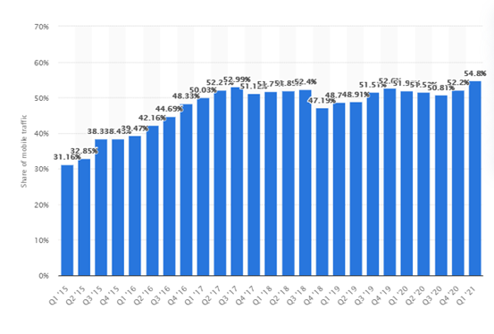
Percentage of mobile device website traffic worldwide from 1st quarter 2015 to 1st quarter 2021. Source: Statista
How does mobile website optimization overcome challenges in user experience?
Mobile devices have a smaller form factor (size) which gives them portability while also sets some hurdles in user experience. The screen size of a mobile device is comparatively small thus the following design objectives should be kept in mind:
Readability:
The text displayed on mobile devices should not be too small, such that it becomes hardly readable, nor should it be too large that it consumes most of the space on the screen, compromising other functionality and features of the website.
Form simplification:
Forms are specific text fields wherein users can enter their information and details as required on the website. Filling user data on a desktop is quite easy in comparison to mobile devices. A good design approach always makes their user avoid more text entry. So an optimized website should ask only that much useful information that is necessary. From a developer’s point of view, drop-down menus can also help in the reduction of form sizes.
Use of interactive splash screens:
A splash screen is a screen that is displayed first when the user clicks on a website application. Having a tempting splash screen can attract users, also one can use a splash screen to advertise their business or company which can further influence the users.
Easy access to contact details:
Contact details and map location services should be visible on the screen and easily accessible, which can compel a user to contact you. It has been observed that many e-commerce websites have customer support details quite prominent or maybe just a few clicks away. This builds brand trust and sometimes pacifies aggrieved customers to a great extent. Map services if used also enable the users to find your business soon with a simple click relocating them to their GPS application.
Now advancing to the main content of our topic is how we can optimize a website for our mobile devices. I have listed certain ways through which it can be accomplished.
1. Simple and effective navigation
Easy navigation: Accessing all the features of the website from one single place brings great relief to the user. It saves browsing time and the user does not have to bother much about shuffling through numerous pages of the websites with multiple redirects.
Contrast links: Any clickable link should appear very distinct, must be working and should be accessed at the same spot so that the user does not have to reshuffle back and forth amongst different tabs as it costs valuable browsing time.
Maintaining relevancy: While navigating, the optimized website should always have a check on unwanted pop-ups which are quite common while browsing on the web. Pop-ups distract the users and hinder their user experience.
Call to action buttons: Having prominent CTA buttons and clickable elements for an optimized website is one of the deciding factors in reducing the complexity of navigation and help the user gain more information about the website. The placement of CTAs should depend on the scanning pattern which majority of users follow while browsing a website on a mobile device.
According to Gutenberg’s principle, zigzag is the most common pattern followed by masses to scan a website from the top left to the bottom right corner. It has also been observed that users mostly notice the bottom right part of the screen which they are viewing. Therefore it is a must to place clickable elements on those respective areas so that they can be noticed well.
The most common form of CTA buttons are register, subscribe, login, etc. The developer should be cautious while placing two CTAs into a close vicinity, which if done can risk the user click the wrong CTA thus ruining the user experience.
Improving bounce rates and conversion rates: Bounce rate tells us how much percentage of visitors have visited a particular website and left without taking any action.
On the flip side if a visitor has successfully visited the site and got the job done defines the conversion rate. It has been noticed that mobile optimization brings a decrease in bounce rate by subsequently increasing conversion rate.
Therefore, following best practices in mobile optimization directly affects bounce rate and conversion rates as well as improves speed.
2. Page load speed
Mobile optimization helps the webpage to load at a faster pace, thus letting the user wait less and anticipate faster results. There are certain ways where page load speed is increased, some of them are as follows:
Web Caching: When a webpage is cached it is stored at a local location from where it can be retrieved easily. There is no need to download it every time whenever the webpage is accessed.
Image compression: Large images take heavy load time, hence optimizing the image by using compression techniques can do the job without affecting the quality of the website.
Code minimization: Minimum codes are compiled faster and hence improve speed.
Use of CDN: Content Delivery Networks use implementation of one or more servers located in a different geographical location instead of one centralized server. So, technically speaking a copy of your web page is stored in multiple servers and can be accessed from anywhere depending upon the location of the user. This saves loading time and bandwidth of the user.
3. Responsive Web design
Designing a website using a responsive design strategy is essential for website optimization. Responsive design means designing a website in such a way that the website adapts to the parameters of the device on which it is being viewed. With a responsive design, the website can adjust itself according to device view mode as portrait or landscape. Responsive design upgrades mobile optimization to a great extent.
4. Optimising thumb zone
It has been observed that people usually prefer a single-hand operation of their mobile device, so it becomes quite obligatory to optimize the website keeping this idea in mind. As a designer, one should always place menus or clickable content to more accessible areas of the screen rather than just placing them somewhere in the corner or top of the screen where reachability comes into question.
5. Using Google mobile-friendly applications
One such tool is provided by Google, which is available on Google’s search console. The user simply has to enter the website URL and the results will itself dictate the story whether the site is mobile-friendly or not. The metrics used here by Google algorithm is page load speed. The slower the page loads the less mobile-friendly it seems to be. Mobile page load speed metric for optimization has been prioritized by google since 2018.
6. Using Website design tools
Not all readers might be aware of a couple of website design tools that are helpful in developing responsive websites. These tools help alter the design layout of your website by making it more responsive. The tools adjusts or makes changes in the website in accordance with the mobile device on which the website content is loaded.
7. Effective web hosting services
A web host with high speed and minimum downtime is a must to host your website since high speed is the most important ingredient for mobile-optimized websites.
8. Using Accelerated mobile pages (AMP)
Accelerated mobile pages were launched by Google to make mobile-friendly versions of your web pages. In AMPs content of the webpage is crafted by removing unnecessary media along with many advanced layouts. AMP web pages can be created by using WordPress, by installing AMP word-press plugin. After installing this plugin, AMP version of web pages are generated at ease.
9. Search Engine Optimization
SEO increases the visibility of a particular website on search engines. It has a couple of benefits such as increased web traffic at your site, the higher tendency of your material to be found on search engines promising desired results. An exemplary SEO helps in optimizing the website for mobile devices. Google in mid-2015 had already announced that its new algorithms will favor mobile responsive websites, thus heightening a dire need for mobile optimization.
10. Lazy Loading
Since the screen of the mobile device is limited in size, so downloading the entire webpage at first is not appreciated, as it consumes resources and affects page loading speed. Therefore, lazy loading is seen as an alternative to this. It means, only that part of the webpage is downloaded by the device which is viewed currently by the user, followed by subsequent downloading of the webpage’s media as the browser screen reaches that part of the site.
Lazy loading can be implemented in form of a Javascript. Layzr.jr is one of a lazy loading plugin that is available across leading web design tools which can be effectively used. A couple of other plugins are A3 Lazy load, LazyLoad by WP rocket, Speedup- Lazy Load, etc.
Driving a Conclusion
At last, optimizing websites for user experience is very essential in today’s modern era. As the use of mobile devices is progressing day by day, hence it has become more important for your website to adjust to new market trends, which is in fact provided by mobile website optimization. Mobile optimization also helps by enhancing customer reachability and satisfaction along with good business returns.
I hope that the methods listed in this post are quite simple and easy to apply thereby making your website gain enough competency in the market. However, these are manual methods and require regressive efforts and detailed tracking. As an alternative, if you’d like to automate your mobile optimization experience, you can make use of the LT Browser for live mobile view debugging across 50+ screens at the same time.
With LT Browser users can test their website on two devices simultaneously on different tablet and desktop sizes and inspect website on different resolutions simultaneously. It comes with DevTools to debug multiple device sizes while performing responsiveness test simultaneously. Test website on various device resolutions with separate DevTools for each.
With LT Browser users can generate detailed performance report of your website in a single click using LT Browser. This helps you with statistics to analyse key performance metrics, accessibility score, SEO, and a scope to improvise the overall performance.